|
The Grumman Avenger
Tri-Color Scheme
via
Kyle Williams

HyperScale is
proudly supported by Squadron.com
With the debut of the 1/32nd Trumpeter Avenger, eager modelers
around the globe are snatching them up, heading home and grabbing
for their trusty bottle of glossy sea blue.
Not so fast...
Although the kit has been referred to as "the best 1/32nd kit
ever" and "the Accurate Miniatures Avenger in 1/32nd scale"
(quite a compliment!), it quickly become apparent to the builder
that Trumpeter left us in the dark when it comes to painting
instructions.
Many modelers simply use the Accurate Miniatures instructions as a
guide, and although this is perfectly fine for the later model
TBM-3, the TBF/TBM-1 utilizing the tri-color scheme needs some
clarification.
When a client asked me to build one of these beasts for him, fellow
HS'er, Homo Plasticus, mentioned having copies of original Grumman
painting instructions as well as a large assortment of VT-83
photography from the USS Essex CV-9. Since I had read in the Plane
Talking forum, that the directions for painting the TBFs was
lacking, I jumped at the opportunity to see the actual drawings and
get painting instructions straight from the (now defunct) factory.
Upon reviewing the drawings and photography, we discovered that
there is some inaccuracies to what most people consider is the
standard tri-color scheme and painting an Avenger correctly is a
little more complicated than we originally thought. Below is a copy
of the original Finish and Insignia diagram as well as SR-2C the
basic camouflage guide dated 1/2/43.
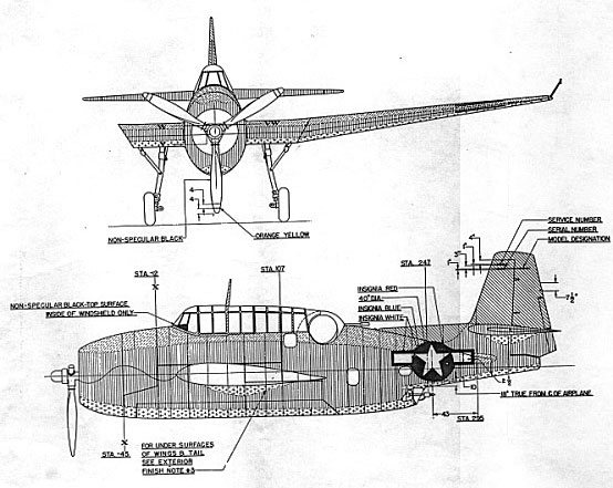
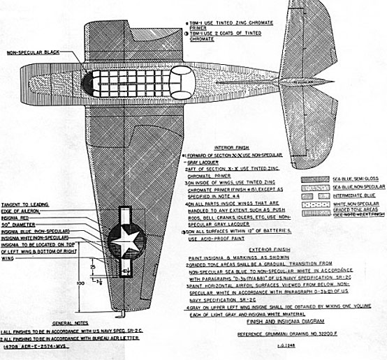
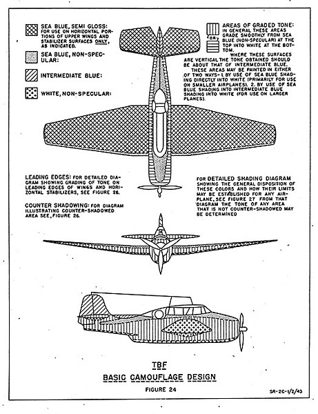
As you read through all the call outs and details, you'll notice
a couple of primary things.
-
There is both intermediate blue,
and painted areas referred to as "graded tone" which is white
oversprayed gradually with the non-specular (flat) Sea blue.
These colors end up incredibly similar, and I'm guessing that in
may instances one was substituted for the other at times.
-
The "graded tone" is applied to
all leading edges. What was once thought of as worn wing areas,
is actually the graded tone. This was applied in an attempt to
create a lighter forward silhouette for enemy gunners to shoot
at.
Other interesting notes include the use of gray lacquer forward
of the firewall and that the upper wing insignia was a mixture of
lt. gray and white. The tail and fillet are intermediate Blue, while
the fuselage is "graded tone".
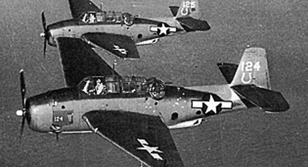
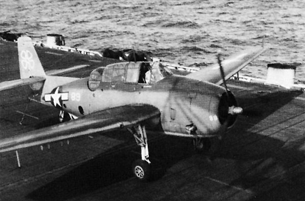
Below are a few photos that illustrate the leading edge treatment.
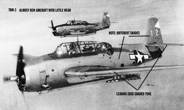
Click the thumbnails
below to view larger images:
Please note that there are other photos which do not reflect the
leading edge treatment. Like any WWII aircraft, there is always
going to be exceptions to the rules, but the standard is illustrated
in the drawings.
I hope these drawings help with all those Avengers out there, and I
look forward to some super builds being posted soon.
I'd like to thank Brett and HyperScale for allowing me to post
this info, and also some special thanks to the U.S.S. Essex CV-9
Organization and Homo Plasticus for all their help.
Text
Copyright 2005 by Kyle
Williams
Page Created 24 February, 2005
Last updated
24 February 2005
Back to HyperScale Main
Page
Back to Features
Page
|  Home |
What's New |
Features |
Gallery |
Reviews |
Reference |
Forum |
Search
Home |
What's New |
Features |
Gallery |
Reviews |
Reference |
Forum |
Search