Home |
What's New |
Features |
Gallery |
Reviews |
Reference |
Forum |
Search
Home |
What's New |
Features |
Gallery |
Reviews |
Reference |
Forum |
Search
|
|
|
Post Shading With Oil Paints by Russell M. Field
In a previous article we explored one approach to emphasizing panels, lines and structural areas on aircraft models by applying contrasting colors as undercoats to the final paint job. That was "pre-shading". This piece describes a way to achieve these effects after the main paint job, sometimes called "post-shading". While there are different ways to do this, for this article I'll be using oil paints. I like oils because they have a long working life, you can get very subtle tones, and once applied they can easily blended for softer color transitions.
Some Philosophy
on Post-Shading Fading panels or washing panel lines is a popular topic on HyperScale's "Plane Talking" Discussion Group. The discussions often involve treating a majority, if not all of, the panels and lines on the aircraft. This can produce stunning results, but if overdone on smaller scales it can actually detract from a model's appearance. That's why I like to fade and emphasize areas instead of individual panels and lines. I find that, to my eye at least, this both ties the model together and directs attention to any features I've put extra work into. Especially in my "home" scale (1/72), I find that if I detail the panels too much, my other detail work just kinda blends in with the rest of the model and the whole thing looks rather "busy". But if the panels and lines present a softer presence, detailed features - be they the cockpit, a gunbay, the engine or even the paint scheme - will stand out in the overall image of the model. By keeping the visual impact of the panels and lines softer and more general, I can create a more homogenous setting in which the "extra-effort" places are islands of detail. Blended patterns of light and dark on the upper surfaces create a certain feeling and establish a topical context for the model. A really faded surface conveys a feeling of use, perhaps war-weariness, while a fresher surface suggests "newness" and vitality (kinda like the difference between the stained, comfortable old work shoe and the shiny new loafer that needs breaking in). If we can achieve this impression with a minimum of distraction, we set the emotional stage and attention moves naturally and automatically to the more detailed areas (didn't realize that effective model presentation involves evoking emotions, did you?).
I use common artists' oil paints and an odorless thinner. Two types of brushes are used, an old "beater" for the drybrushed fading effects and at least one good-condition flat or chisel brush (with a sharp, straight bristle edge) for the panel line emphasis (different widths of the latter may be handy). Also get an artist's blending stump (also known as a blending stick), some cotton swabs with soft stems (not the hard plastic kind), or cotton balls.
The basic steps are:
Step 1:
You can do this on a glossy surface, but with a dull finish I feel I can better judge and control the effect. It also holds the oil paints better; in any case, some overcoat should be applied before post-shading. This makes it easier to remove the oils if you decide you want to start over, and helps seal and protect the decals. Step 2: Since the underside is normally more protected than the topside, we don't worry about fading it. The topside colors on this plane are RLM 75 Grauviolett and RLM 74 Graugrun (read these as "purple" and "green"). For fading, we want to lighten the base colors without hiding or distorting the base tints. Using white paint drybrushed "neat" - by itself - would work, but to my eye is somewhat stark, even when lightly applied. Alternatively, we can look for a color that will reflect the base colors but still give a faded look. Going back to Art Class 101, red + blue = purple, and green = yellow + blue. The common element is blue; if we make a drybrush medium of VERY light blue, we can lighten the plane's appearance without making too "pale". We mix a little blue with a lot of white to get this color (for planes with green-on-brown camo, I use white with a touch of yellow, which is common to both colors; I tend to use the yellow mix for all-green planes as well. A cream color works well here also).
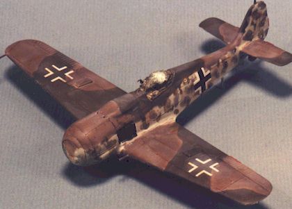
For panel line emphasis on the topside, I generally use a dark shade of brown (umber, sienna, etc.) to represent accumulated dirt and grime. Some modelers use shades of gray; it depends partly on the subject's environment. For example, carrier-based aircraft may get grimy, but not usually "backyard" dirty; also, consider the color of native dirt in various parts of the world: a CBI plane might have a different color dirt or dust than one based in North Africa. Other than that, let personal preference be your guide. On the underside I normally use a dark yellow, like yellow ochre, with white. Consider, also, the way the subject aircraft would be treated. A plane pulled from active duty for use as a test-bed may be service-worn and faded, but typically not really grungy. Such units tend to be cleaner and well-kept; front-line planes in heavy service, however, are more likely to show grime accumulation. Step 3: On the wings, I'll fade a small area toward the tip, a larger area around the middle and maybe a smaller patch near the wing root without paying attention to actual panel lines. I might fade part of the leading edge, but I'll vary number of patches and their locations between the port and starboard wings. I'll hit an area ahead of the cockpit and one or two spots on the aft spine as well; if I want it REALLY faded I'll drag the brush down the sides a bit, too. The key here is not to evenly fade the whole surface. For panel line emphasis I'll take a panel line behind the leading edge, often the length of the wing, and maybe one on the trailing edge; for fore-aft lines, one toward the wingtip, one slightly off center of the wing and (sometimes) one near the wing root. This pattern is pretty much repeated underneath. The fuselage normally gets a couple of vertical lines on each side and over the spine, with one or two in the cowling area. Remember that we're not coloring or filling in the lines themselves, just highlighting the locations of a few key lines. Step 4:
This photo contrasts the faded spine and port wing with the unfaded starboard wing. Step 5: Now we emphasize the selected panel lines. We don't do this by directly coloring the lines, but by shading adjacent areas. Generally speaking I like to shade the outboard forward corner of an area using a "line drag" technique (it probably has another name, but that's what I call it). Here's where you use the straight-edged flat or chisel brush. Load the brush and wipe it off in typical drybrush fashion. Then lay the straight edge of the brush along the aft side of the line you want to emphasize, in an outboard corner; move it slightly side to side along the line, then drag it lightly aft, lifting it off the surface as you do so. Then lay it along the adjacent fore-aft panel line and repeat the process, dragging it aft and very slightly inboard.
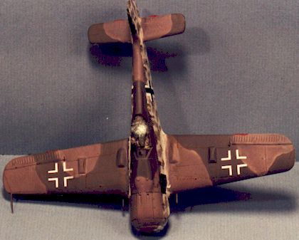
This picture shows the starboard wing faded but not yet shaded, with the port wing and spine both faded and shaded. This is another "go lightly" process. If you apply too much, remember that removal will take off the underlying fading paint as well. Hold the model at arm's length and look it over after each stroke so you can better gage the overall appearance. You don't want lines or panels to stand out; we're looking for a subtle, flowing impression more than a specific demarcation. Step 6:
This will further blur the color edges and integrate the entire surface to create a unified appearance. BE CAREFUL, though: you must not use so much pressure as to dent or score the surface. This is a particular concern if you use a cotton swab; be sure to use a swab with a soft stick, not one with a plastic center, as the latter will almost certainly mar the model. The pictures in this section show the upper and lower surfaces faded, shaded and blended.
Give the oil paints a day or two to fully cure. After blending, they'll take on a matte sheen; if this is too glossy for you, over-coat with your favorite dull spray. As I said earlier, this is a technique I've used on 1/72 scale aircraft. In all honesty, I've never built a 1/48 (though I have 3 … no, 5 1/48 kits in "the pile"). Panel and line detailing obviously works well in many instances on the larger scale (witness the many superb examples on Hyperscale!); if anyone tries this softer approach on a 1/48, I'd be interested in seeing the results! Article, Model and Images Copyright © 1999 by Russell
M. Field
|
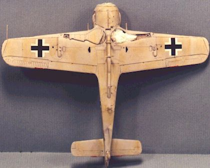
 The
subject is a 1/72 Revell/Germany Fw 190 (a different example of the same kit
used in the pre-shading article). In these pictures we see the airframe painted,
decals applied and dull-coated.
The
subject is a 1/72 Revell/Germany Fw 190 (a different example of the same kit
used in the pre-shading article). In these pictures we see the airframe painted,
decals applied and dull-coated.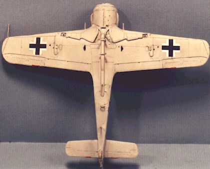 NOTE:
Check your references here (standard disclaimer, right?) … I have heard that
some wartime paints reacted differently with prolonged exposure to the elements,
taking on a more chalky appearance, and that some even suffered from different
degrees of pigment breakdown. When you realize that quality control was not
always real consistent, this makes sense.
NOTE:
Check your references here (standard disclaimer, right?) … I have heard that
some wartime paints reacted differently with prolonged exposure to the elements,
taking on a more chalky appearance, and that some even suffered from different
degrees of pigment breakdown. When you realize that quality control was not
always real consistent, this makes sense.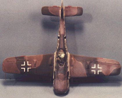 SO
… now we know the colors we'll use and where we'll apply them. Prepare the
fading mixture, load the "beater" brush and drybrush the areas you
want to fade. Go lightly here, but if you do get a spot too faded you can use a
cotton swab moistened with thinner to remove some of the oil paint. Again, this
is why you want to apply a clear gloss or dull coat over the final decal job.
SO
… now we know the colors we'll use and where we'll apply them. Prepare the
fading mixture, load the "beater" brush and drybrush the areas you
want to fade. Go lightly here, but if you do get a spot too faded you can use a
cotton swab moistened with thinner to remove some of the oil paint. Again, this
is why you want to apply a clear gloss or dull coat over the final decal job. Think
of it as shading the upper left corner of a square or rectangle. Use the same
technique on the fuselage and underside (using the underside color, of course).
Again, don't do this on EVERY panel line, just a few major ones to give a
feeling of shape.
Think
of it as shading the upper left corner of a square or rectangle. Use the same
technique on the fuselage and underside (using the underside color, of course).
Again, don't do this on EVERY panel line, just a few major ones to give a
feeling of shape.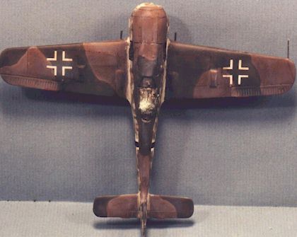 With
all areas faded and shaded to your satisfaction, the crowning touch is to blend
the areas. Concentrate on the transition from the panel emphasis color to the
fading color; also look for any grainy spots that need smoothing. I personally
prefer a blending stump, but you can use a cotton ball or swab to rub the
surfaces with moderate pressure.
With
all areas faded and shaded to your satisfaction, the crowning touch is to blend
the areas. Concentrate on the transition from the panel emphasis color to the
fading color; also look for any grainy spots that need smoothing. I personally
prefer a blending stump, but you can use a cotton ball or swab to rub the
surfaces with moderate pressure.